Case Studies

Web App Prototypes

No field guide is complete without providing a collection of examples to help in identification of best practices and to show how features are implemented. Throughout the next chapter, we've created a series of sample applications that address many of the common scenarios seen in modern web applications. Each application provides detailed commentary about the design decisions, the way features should be implemented and technology used.

Even though they're fictitious, these case studies show how real apps could work.

Using the case studies

These web applications were designed to provide you with ideas on how to approach application design for some of the more common scenarios that today's web apps. With the exception of the Khan Academy, each case study is for a fictitious company.

As you look at each case study, hover over the different HTML5 logos below the images for descriptions about how those technologies are used in the application. You can also click on images to see a larger, more detailed version.

The Case Studies

  1. 1. Shipshot: A Package Tracking App to track the status of packages and online purchases made by the user.
  2. 2. Wayfindit: A Trip Planner App to help the user keep track of trip reservations, travel plans and bookings.
  3. 3. The Khan Academy: An Online Learning Tool with over 2800 videos, covering everything from arithmetic to physics, helping students learn what they want.
  4. 4. Picture Page: A Photography Blog a beautiful way to view photography that puts the photo at the center of the experience.

Case Studies

Shipshot Package Tracking

Online commerce shows no sign of slowing down. And as it grows, so too does the number of people tracking their packages online. Of all the functionality offered on a shipping company's website, package tracking is, by any estimate, the most important to the greatest number of shoppers. And with precious few exceptions across the web today, that functionality is lacking in usability, responsiveness, and overall quality, making for a poor experience..

Enter HTML5 and with it a new approach to web applications. The features of HTML5 have a lot to offer in the package tracking department — let's take a look at a rethinking of a Package Tracker.

A Tracker Apart

Our Tracker app stands alone from the rest of the Shipshot website. A visitor to this app is primarily interested in tracking packages, so the interface is free of the visual and functional distractions of site navigation, promotions, store locator utilities — nothing that isn't about package tracking shows up here. The result is an app that feels fast and is intuitive. It's also bookmarkable, so the Tracker is just a click or a tap away, looking and feeling like a standalone service.
Shipshot Case Study Design 01

SEMANTICS

Take advantage of HTML5 tags like the new <progress> bar.

CONNECTIVITY

Realtime data transfer for up-to-the-minute package status.

CSS3

CSS3 styling for flexible, lightweight brand-building design regardless of screen size.

For those who need to buy shipping labels or locate a store, however, the Shipshot logo persists in the upper left hand corner — our visitor can always click there and access the rest of the Shipshot website.

Taking advantage of HTML5's ability to adjust the presentation according to the viewport, our Tracker app is responsively designed — mobile visitors see an interface that's as big and bright and easy to navigate as the one laptop users work with.
Shipshot Case Study Design 02

SEMANTICS

Utilize the HTML5 placeholder attribute for text input instructions.

OFFLINE STORAGE

Offline capabilities keep track of recently tracked packages for quick reference.

Getting to the Packages Getting to You

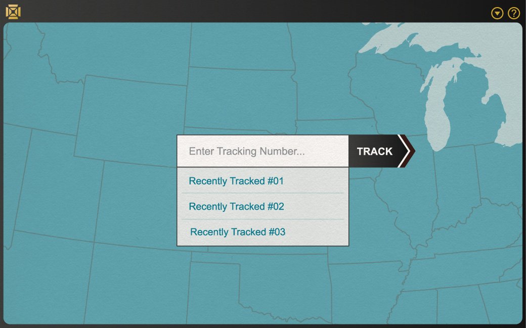
The first thing we ask for is a tracking number. The textbox for it is front and center, big and unmistakable. The field uses an HTML5 placeholder attribute for instructional text and local storage for the list of recently tracked packages below it, each labeled not just by some inscrutable number, but with the sender and any title the visitor might have previously assigned to it.

The Tracking Screen

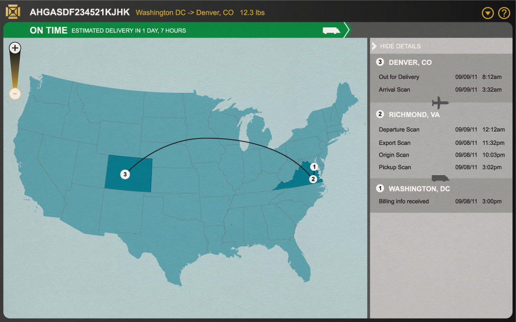
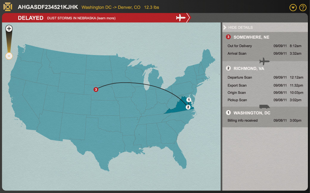
Where's the package? When will it arrive? Is it on time? These are the three most important pieces of information about a package on its way, and our

Shipshot Case Study Design 03

SEMANTICS

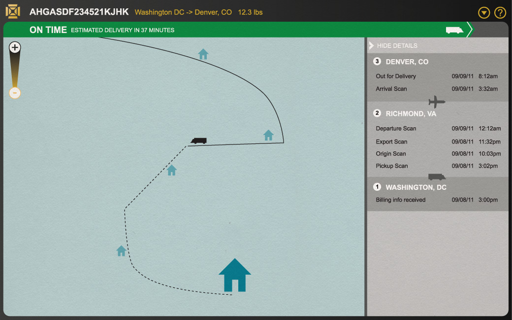
HTML5 ;progress bar for a quick visual reference of package status.

CONNECTIVITY

Package progress and weather conditions are updated in real time.

GRAPHICS

An interactive map with routes and checkpoints engages users.

CSS3

Color alerts for on-time/delay are quickly implemented with stylesheets.

Tracker app displays them all immediately. An HTML5 progress bar spanning the entire display gives an immediate visual cue as to the package's progress. Typical color signals provide further visual reinforcement — green for on time packages, red for delayed ones. A specific estimate is offered, and an interactive map and a list of checkpoints fill out the display to show just where the package has been. The map is enhanced with HTML5 canvas elements, drawing points and lines and animating as new information comes in or is selected by the visitor. Icons to indicate the type of transportation and whether the estimate was met for each checkpoint give an overview of the package's trick that is both easy to understand and rich with information.

Shipshot Case Study Design 04

DEVICE ACCESS

GPS-enabled devices can put the user right on the map.

GRAPHICS

Zoom on the HTML5 canvas-based interactive map for neighborhood level detail.

PERFORMANCE

Keep the user experience snappy with enhanced, optimized code.

Selecting a destination in the route rundown zooms into the map to provide more details about individual checkpoints and estimated arrival times. Here again the canvas element provides for cross-platform, high-performance graphics.

Shipshot Case Study Design 05

OFFLINE STORAGE

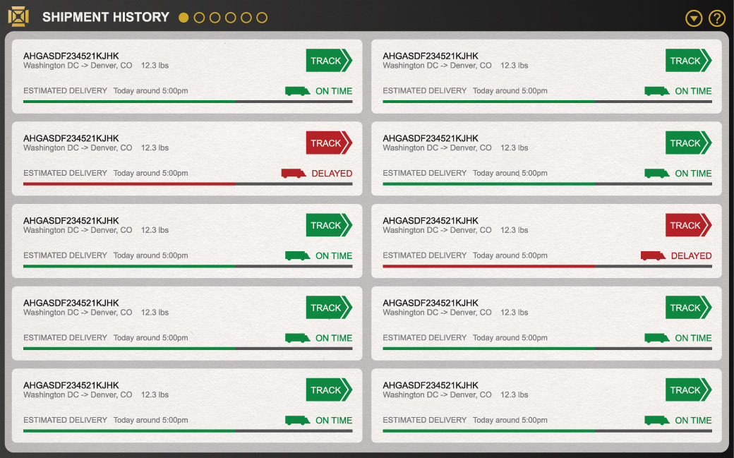
Keep track of shipping history, even offline.

CONNECTIVITY

Optimized performance for real-time updates of multiple packages.

CSS3

Color-coded status information for quick glance updates.

A click away, under the 'Recently Tracked' tab atop the interface, we present a list of recently tracked packages. This compact view provides the same important visual cues as the tracking detail page, but for several packages at once. HTML5's local storage makes referencing this information instant and login-free, a convenience in any situation.

Shipshot Case Study Design 06

SEMANTICS

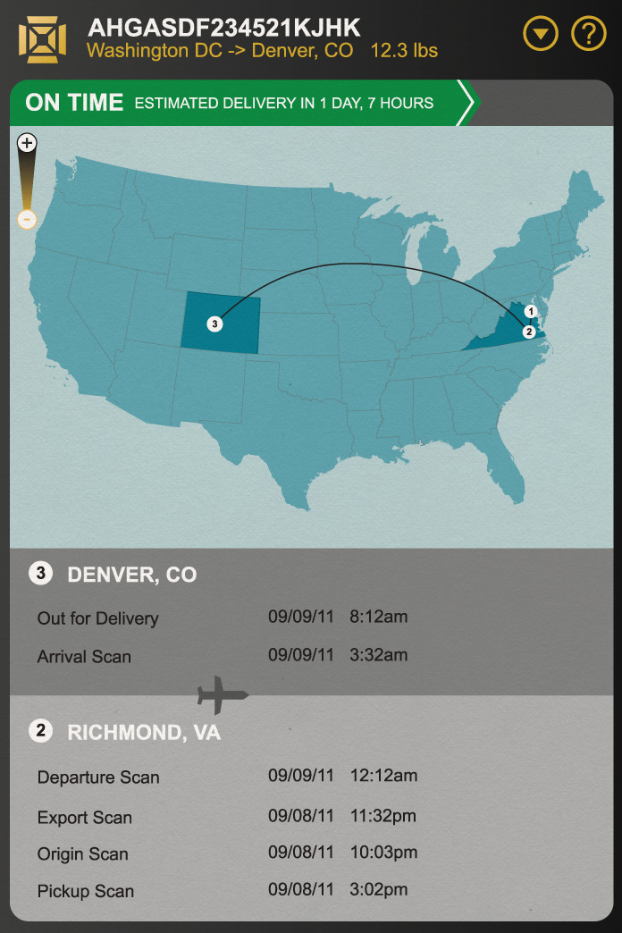
Viewport awareness allows for seamless visual performance, even on small screens.

DEVICE ACCESS

Information layout is optimized for rotation-capable devices like smartphones.

CSS3

Mobile stylesheets keep useful data front and center for quick tap access.

The Tracking Screen Again, but Smaller

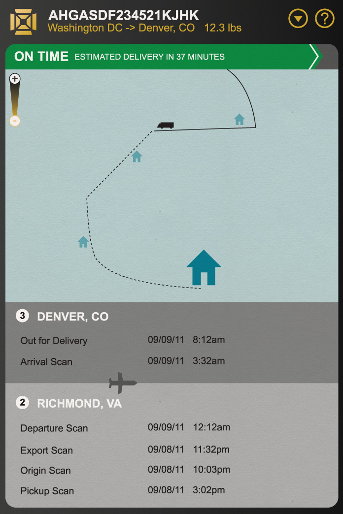
Using HTML5's viewport awareness and responsive web design, minimal tweaks to the interface allow the same information to be presented on a smaller screen without losing an ounce of usability. The progress bar, the list of destinations, the map — all present and accounted for, now stacked atop one another for easier comprehension on a mobile screen.

Shipshot Case Study Design 07

DEVICE ACCESS

GPS-enabled devices mark the user's location on the delivery map.

GRAPHICS

Interactive delivery route map, even on the small screen.

Package tracking is the sort of thing people do repetitively — anxious to receive that book or that new coat — and they shouldn't be forced to jump through hoops every time they need updated information. No more guessing at estimates or copying and pasting a tracking number from an email receipt that becomes harder to find as it becomes more and more buried each day. Our Tracker app is easy to access, remembers what you're expecting, and operates quickly — it delivers on the promise of HTML5, embodying the full potential of a web app today.

Case Studies

Wayfindit: Trip Planner App

More than most, Wayfindit’s app must embody convenience. Travel is complicated, and whether for business or pleasure, a smooth trip is one free of unexpected stress from doorstop to destination and back again. Wayfindit's app should stay out of our busy traveler’s way but provide the information they need as quickly and as accurately as possible when asked. That means a minimal, intuitive, and responsive interface with relevant, contextually important information front and center — a goal accomplished with help from the HTML5 features for location awareness and offline storage.

A Perfect Pocket Guide

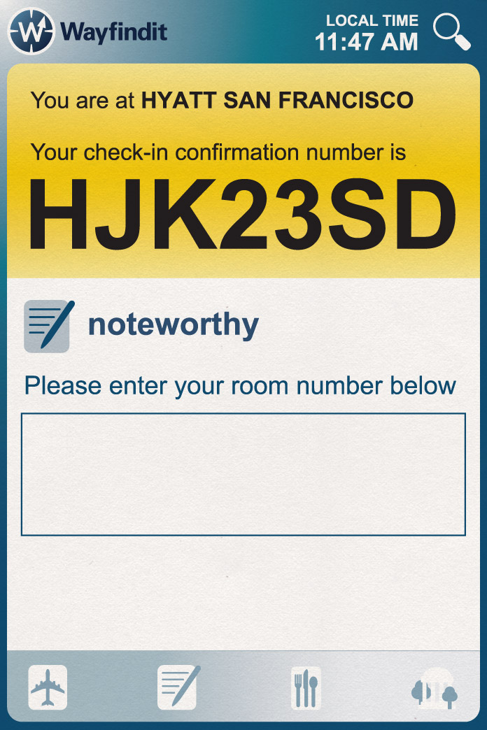
From your pocket or your bag, an intinerary — immediately. With local storage, location awareness, and just checking the time of day, the Wayfindit Trip Planner app presents a schedule of your day, recommendations if you've got time left over, notifications if you're near a particularly picturesque spot, and a smart map and directions.

The Wayfindit Trip Planner app takes advantage of HTML5 features to provide travelers with a convenient, always-ready, intelligent companion while they travel. It's responsive — visually, performance-wise, and aware of our traveler's needs and context. It's the kind of tool that makes a great vacation even better and is a joy to use.

Wayfindit Case Study Design 01

DEVICE ACCESS

GPS-enabled devices display a location-aware welcome screen with localized information.

CONNECTIVITY

Compare current location with previous and adjust content accordingly.

PERFORMANCE

Compressed assets and optimized markup ensure expedited data delivery.

Welcome to the Neighborhood

Has our traveler just landed? Based on their location and the last time the app was able to connect to the internet, it seems like it. The app immediately offers a taxi, nearby restaurants or activities, or directions to the hotel (and just how far away it is).

And all of the information arrives in milliseconds — the app is smartly designed from the inside out and its assets have been compressed to ensure it feels speedy.

Wayfindit Case Study Design 02

OFFLINE STORAGE

Remember useful information like reservation, room and parking spot numbers regardless of connection.

CSS3

Stylesheets maintain visual consistency throughout: all new information and alerts are presented in high contrast colors.

Room Service

Our traveler has driven their rental car to the hotel. The app knows this and can offer to remember the parking space number for later, and does the same minutes later at the checkin counter. All of this information is locally stored — it'll be immediately available whether or not there's internet connectivity.

Wayfindit Case Study Design 03

SEMANTICS

HTML5 media queries help make the most of viewport size and orientation.

DEVICE ACCESS

Travel app should maximize device capabilities like GPS and serve location-aware content.

CONNECTIVITY

Serve content like suggested destinations based on current time of day.

Wide Range of Options

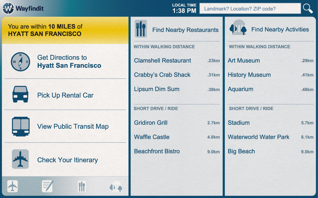
The Wayfindit Trip Planner App is ‘responsively’ designed with HTML5 and CSS3 media queries. On a larger screen, like a laptop or tablet, it can offer more information. In addition to important tasks like hotel check-ins and rental car pick-ups, peripheral information like restaurant and activity recommendations can be presented. (The same information is available to phones as well, as the down-scrolling traveler will discover.)

Recommendations for restaurants and activities are made based on the traveler's location and the time of day.

Wayfindit Case Study Design 04

OFFLINE STORAGE

Locally stored database quickly displays updated dining and transportation options.

DEVICE ACCESS

GPS guides the way once again, and mobile users can make one touch phone calls for reservations.

GRAPHICS

Simple, visually consistent icons provide useful information at a glance.

Feeling Hungry

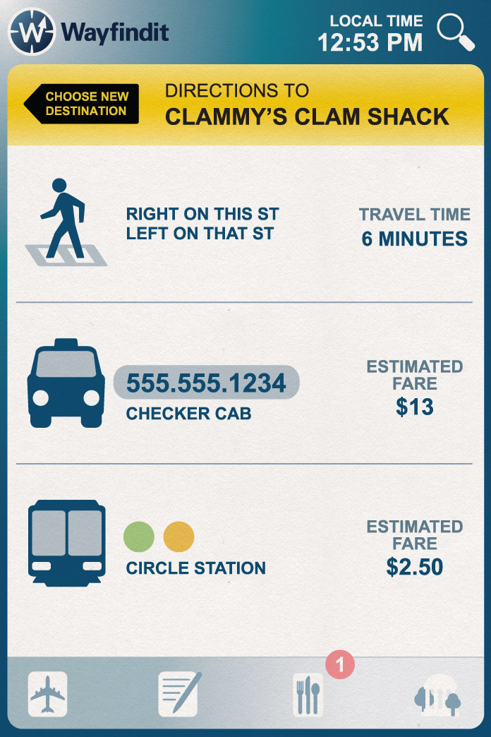
Planning a trip to a restaurant? Wayfindit's Trip Planner knows how to get there — on foot, in a cab, or using public transport (if it knows there's no rental car, that is). If our traveler is on the go and using the app on their phone, the app can make the right phone call with just a tap.

Ever location-aware, the app can offer up interesting places nearby with visual cues, using its locally stored database of visited places to make smart recommendations.

Wayfindit Case Study Design 05

SEMANTICS

HTML5 form elements keep the code light and the user experience friendly.

OFFLINE STORAGE

Remember today's events and plan for tomorrow's with locally-stored notes.

CONNECTIVITY

Rate and share your experiences to help shape trips for other Wayfindit travelers.

Nightcap Recap

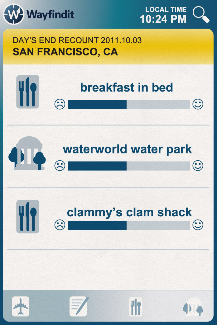
A day's end recount is a good way for our traveler to remember the good times and build strong memories. It's also a great way to improve their recommendations tomorrow! Some shiny new HTML5 form controls make it easy to rate the day's activities and move on.

Case Studies

Khan Academy

The Khan Academy website offers a wealth of educational opportunities in the form of thousands of video classes. They are well-taught, always available, and completely free. The site also features a 'knowledge map' and statistics, guiding you through a series of lessons and tracking your progress visually. It's a superb and bountiful resource for students worldwide, in school or out, studious or curious. It deserves the best presentation technology the web has to offer, so we've taken Khan Academy and brought it into the app era with HTML5.

Focus on the Blackboard

View the current Khan Academy web site here for comparison

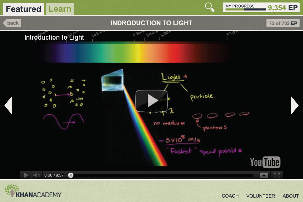
Khan Academy's video content is the focal point of its website, and our redesign puts it front and center, free of distractions. The video fills the screen, with ancillary information disappearing when it isn't needed, making for an immersive experience. And when the navigation does appear, it's minimal — we offer only what students need to continue learning uninhibited. Comments and Q&A sections are minimized until expanded, and their content isn't fetched until it's asked for, saving on load time. And keyboard shortcuts make navigating even easier.

Khan Academy Case Study Design 01

SEMANTICS

Take advantage of HTML5 meta viewport tag and progress bar.

OFFLINE STORAGE

Coursework progress is stored locally for offline access and expedited subsequent visits.

MULTIMEDIA

Video tutorials are scaled to fill screens for an immersive experience.

The interface itself is responsive to the device accessing it, too. Mobile users see the same content in a layout optimized for their device using HTML5's meta viewport tag and CSS3's media query capabilities.

A progress bar (using HTML5's <progress> element, of course) provides immediate visual feedback on a student's place in a given course or section. The use of local storage makes checking on this progress a breeze -- there's no need to log in to store or record data, and future visits enjoy a performance boost.

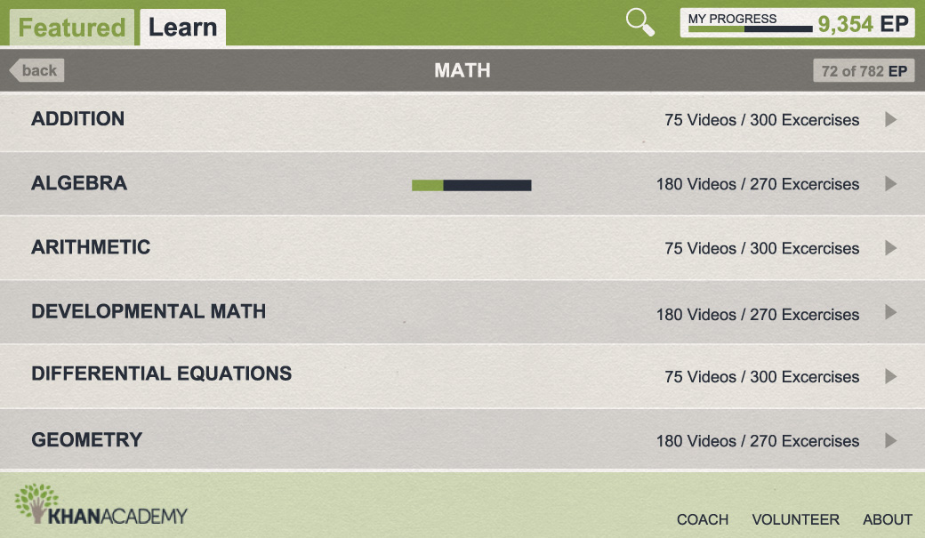
Khan Academy Case Study Design 02

SEMANTICS

HTML5 progress bars show course status in individual sections and the Academy overall.

CSS3

Simple, intuitive design for quick content drilldown regardless of screen size or orientation.

A Tree of Learning

Under the 'Learn' tab, we enter a content drilldown that makes navigating the thousands of lessons and practice exercises on Khan Academy easy by breaking it up into categories and subcategories. Here, too, progress bars offer a visual indication of the student's advancement through each category.

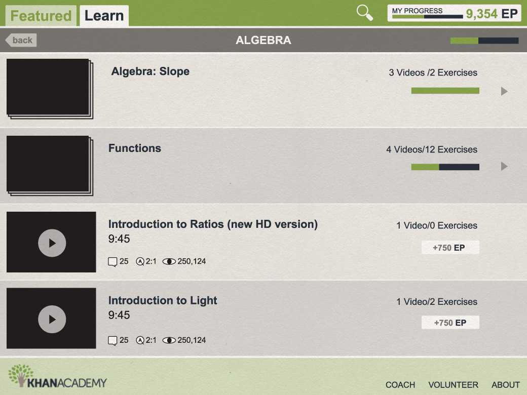
Khan Academy Case Study Design 03

OFFLINE STORAGE

Progress in all sections is stored offline for at-a-glance status updates.

GRAPHICS

Intuitive graphics differentiate single clips from multiple stacks.

PERFORMANCE

Optimized structure pairs course clips with corresponding questions.

Once beyond the category and subcategory, a list of lessons is shown, with groups of videos in a single lesson being visually indicated by a stack. In a notable difference from the existing organization of the Khan Academy website, video lessons and practices are grouped as sections so that related content is accessible in a single place.

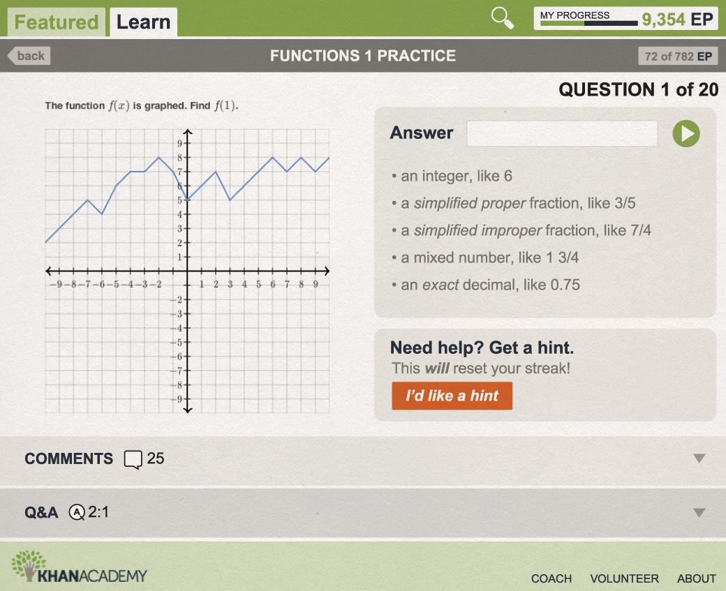
Khan Academy Case Study Design 04

SEMANTICS

HTML5 form elements offer simple, intuitive layout opportunites for a pop quiz.

CONNECTIVITY

Stuck? Get hints quickly with optimized data connectivity.

GRAPHICS

Interactive charts and graphs help engage users and encourage learning.

CSS3

Flexible layouts optimize information display based on viewport and screen size.

The Khan Academy web app takes advantage of HTML5 features to provide students with a well-designed and always-on resource for learning, practicing, and tracking what they've accomplished. It can be tricky to encourage study, but Khan Academy removes as many barriers as it can. It's speedy, responsive, and offers intuitive navigation of an enormous cache of material, all without distraction.

Case Studies

Picture Page

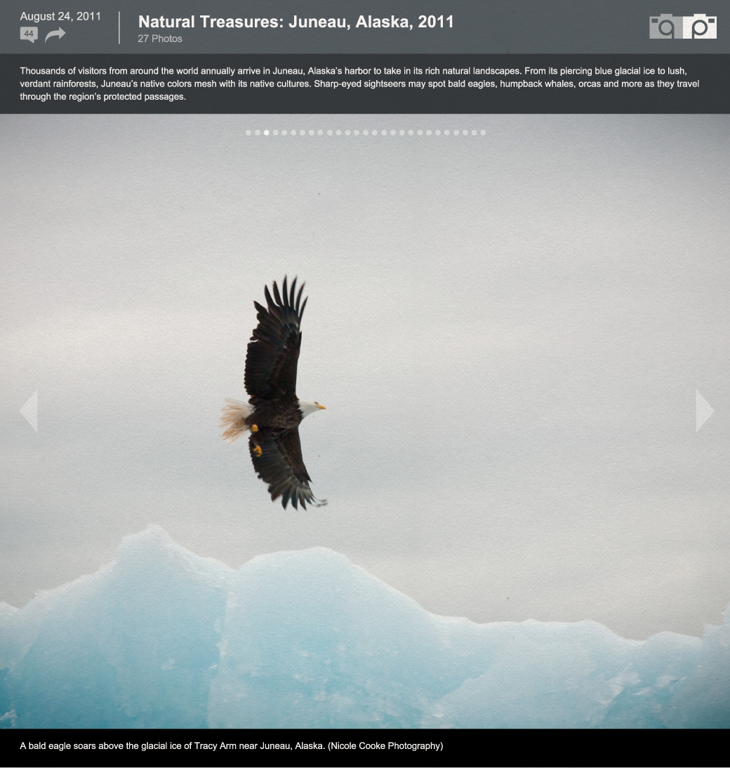
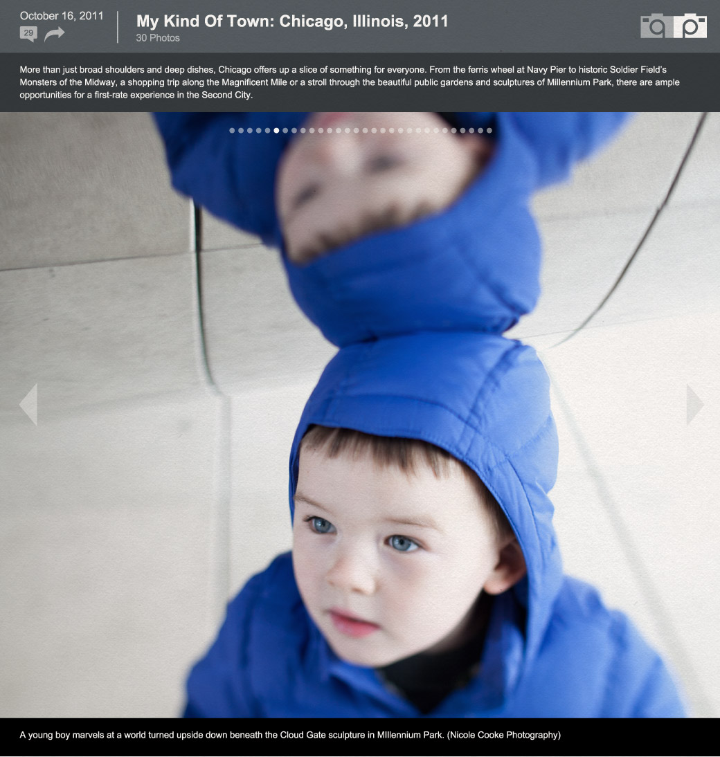
The Picture Page gives it's users a new and different way to see what's happening in the world around them. If a picture is worth 1000 words, then The Picture Page is provides users with more emotion and detail than could be provided in most publications. Simply a long series of large pictures with small, simple, unobtrusive captions, the site was powerful because it let the content be the focus — the images tell the story. No popups, no difficult-to-navigate slideshows, no tiny thumbnails. Our HTML5 Picture Page app carries forward the innovation many of the current photo news sites into a new world of web application development.

If It Ain't Broke, Don't Fix It

The Picture Page described the site perfectly — those large images are the key to its effectiveness and its success. Our HTML5 re-imagining of The Picture Page makes its Pictures even Bigger. Using CSS3's background-size property to auto-scale photos, a fullscreen layout makes the photos even more the focus — no container website chrome to get in the way.

Responsive design downgrades the site gracefully for mobile users; CSS3 media queries present a full-screen photo experience without sacrificing performance. Detecting swipes and taps as though it were a native mobile app, The Picture Page feels incredibly natural on every device.

Picture Page Case Study Design 01

DEVICE ACCESS

Swipe through images on touch-capable devices, just like a native app.

CONNECTIVITY

Automatically update with today's Picture Page when the web app is launched.

GRAPHICS

Maximize screen space to keep the focus on the Picture Page.

CSS3

CSS3's background-size property auto-scales photos to full viewport width.

Power Users Rejoice

Javascript enables us to offer keyboard shortcuts for navigating The Picture Page. Using the left and right arrow keys or the emergent convention of the J and K keys to move forward and backward through the photos makes browsing easy and reduces the distraction of finding the mouse while taking in the imagery. Arrows are hidden when not in use, so as not to obscure the current image.

Using the HTML5 <progress> tag, we can semantically demonstrate the visitor's progression through the photo album.

The Picture Page is a perfect example of the kind of site that doesn't need a ground-up reconstruction for the app era. As-is, it's an elegant, visually stunning, and beloved website, so we apply the available enhancements offered by HTML5 where appropriate, leveraging the site's existing affordances with up-to-date techniques and technologies to present a Picture that's even better and Bigger.

Picture Page Case Study Design 02

SEMANTICS

HTML5 progress bar updates as usesr flip through album pages to their favorite photos.

DEVICE ACCESS

Navigation is optimized for input on a range of devices, from swipes and taps to keyboard clicks.

PERFORMANCE

Assets are optimized and compressed to facilitate rapid data delivery.

CSS3

Navigation tools are simple and fade from view when not in use.